You stare at two shirts in a store. One looks like the ocean, the other feels deeper and richer. Which is teal? Which is turquoise? You can spot the difference quickly with a side-by-side look. Teal shows as a deep blue-green (#008080), while turquoise appears brighter and more vibrant (#40E0D0). If you feel confused by teal vs turquoise, you are not alone. Use these color codes to see the contrast for yourself.
|
Color |
Hex Code |
RGB |
|---|---|---|
|
Teal |
#008080 |
0, 128, 128 |
|
Turquoise |
#40E0D0 |
64, 224, 208 |
Key Takeaways
-
Teal is a dark blue-green color. Turquoise is a lighter blue-green color. You can use their hex codes to tell them apart. Teal’s code is #008080. Turquoise’s code is #40E0D0.
-
Teal has cool undertones. These can be green or gray. This makes teal feel calm. Turquoise has warm yellow undertones. This makes turquoise feel bright and full of energy.
-
Think about the mood you want. Pick teal for a calm and professional space. Choose turquoise for a fun and lively place.
-
Light changes how these colors look. Always check teal and turquoise in different lights. This helps you see their real colors.
-
Match teal with gray or navy for a classy style. Pair turquoise with white or coral for a happy and fresh look.
Teal vs Turquoise: Visual Comparison

Color Swatches and Codes
You can tell teal and turquoise apart by looking at their color swatches and codes. When you put them next to each other, teal looks darker and not as bright. Turquoise blue is lighter and stands out more. The hex and RGB codes make it easy to know which color is which.
|
Color |
RGB Code |
|
|---|---|---|
|
Teal |
#008080 |
0, 128, 128 |
|
Turquoise |
#40E0D0 |
64, 224, 208 |
Teal is found on the blue-green color line and looks like a dark blue-green. Turquoise blue is closer to a bright green-blue. If you compare them, teal looks richer and more grown-up. Turquoise blue feels fun and fresh.
Undertones and Brightness
You can learn about teal and turquoise by looking at their undertones and how bright they are. Teal usually has green or gray undertones. This makes teal feel cool and calm. Turquoise often has yellow undertones, so it feels warmer and more lively.
When blue gets closer to yellow, it becomes warmer. Turquoise is a warmer kind of blue, so different shades can feel warmer or cooler.
-
Teal has green or gray undertones, so it feels cooler.
-
Turquoise is warmer and can have yellow undertones.
-
Undertones change how the colors look and work in designs.
When you look at how bright they are, you see another big difference. Teal is not as bright and looks deeper. Turquoise blue is much brighter and stands out more.
|
Color Name |
Hex Code |
|
|---|---|---|
|
Teal |
(54, 117, 136) |
#367588 |
|
Turquoise |
(64, 224, 208) |
#40E0D0 |
Turquoise blue pops out in clothes and designs because it is so bright. Teal is less bright, so it feels calm and steady.
Key Differences Table
This table helps you see the main differences between teal and turquoise. It shows their undertones, brightness, and the feeling they give.
|
Feature |
Teal |
Turquoise |
|---|---|---|
|
Undertones |
Darker, muted blue-green with gray undertones |
Brighter, vibrant hue leaning towards sky-blue-green |
|
Brightness |
More muted and deeper |
Brighter and more vibrant |
|
Overall Vibe |
Conveys stability and sophistication |
Signals energy and rejuvenation |
Teal helps you feel calm and steady. Turquoise gives you energy and helps you think clearly. When you pick teal or turquoise, think about the feeling you want.
The main differences between teal and turquoise come from their undertones, brightness, and the feelings they give. Teal and turquoise are not just about color codes. They are about how you feel and how they fit your style or design.
If you want a color that feels steady and classic, pick teal. If you want something bright and full of life, choose turquoise blue. There are many blue-green shades, but knowing about teal and turquoise helps you choose the best one.
Teal and Turquoise in Real Life
Fashion and Accessories
You can find teal and turquoise in many clothes. Teal looks darker and softer, so people wear it for fancy events. Big brands like Elie Saab and Denzil Patrick use teal for dresses and coats. Transformative Teal showed up in fashion shows for late 2024 and early 2025. Tiffany Blue is close to teal and has been Tiffany & Co.’s color since 1998.
-
Teal is good for suits, blazers, and classic accessories.
-
Turquoise stands out in summer outfits, jewelry, and fun bags.
-
Teal looks best with gray, navy, or black for a neat style.
-
Turquoise goes with white, tan, or bright colors for a happy look.
“WGSN says 98% of people pick things because of color. Color is important for brands and their products. Brands need to think about how color makes people feel.”
Interior Design Uses
You can see teal and turquoise in new homes. Teal gives rooms a cozy and deep feeling. Designers use teal for couches, wall paint, and kitchen cabinets. It matches wood, stone, and ceramics. Teal works in old and new rooms.
-
Teal adds interest to living rooms and bedrooms.
-
Turquoise makes bathrooms, kids’ rooms, and walls brighter.
-
Teal looks nice with cream, taupe, and charcoal.
-
Turquoise matches earth tones, jewel colors, and soft pastels.
Designers pick teal for a calm and steady mood. Turquoise brings energy and a fresh feeling to rooms.
Branding and Digital Design
You see teal and turquoise in logos, websites, and packages. Brands use teal to show trust and strength. Turquoise shows creativity and excitement. Paint companies and trend reports talk about these colors every year. Transformative Teal was picked as Color of the Year for 2026, so it is getting more popular.
|
Color Name |
Hex Code |
|---|---|
|
Bright Turquoise |
#00CED1 |
|
Medium Turquoise |
#48D1CC |
|
Turquoise Blue |
#40E0D0 |
Teal and turquoise help brands get noticed online. You see them in tech, fashion, and lifestyle brands. These colors make websites look cool and new.
Choosing Between Teal and Turquoise
Quick Selection Tips
You might wonder how to pick the right color for your project or outfit. Here are some quick tips to help you decide:
-
Think about the mood you want. Teal brings calmness and professionalism. Turquoise feels playful and fresh.
-
Look at the setting. Teal works well in offices and formal spaces. Turquoise shines in creative or casual places.
-
Consider color temperature. Both colors are cool, but teal feels deeper. Turquoise looks brighter and lighter.
-
Ask yourself about the emotional response you want. Teal can help you focus. Turquoise can spark creativity.
Tip: If you want a color that helps you relax or concentrate, choose teal. If you want energy and a sense of fun, go for turquoise.
Best Pairings
Pairing colors can make your design or outfit stand out. Use this table to find the best matches for each color:
|
Color Pairing |
Description |
|---|---|
|
White |
Makes teal or turquoise pop and look clean. |
|
Coral |
Adds energy and a lively contrast. |
|
Gray |
Gives a modern and elegant touch. |
|
Mustard Yellow |
Brings vibrancy and joy. |
|
Navy Blue |
Blends well and adds depth. |
|
Neutrals (Beige/Taupe) |
Softens the look and lets the main color shine. |
You can try lime and white for a fresh style, or gold and cream for a touch of luxury. Navy and gray create a nautical feel, while terracotta and beige give a warm, earthy vibe.
When to Use Each Color
You may ask, “When should I use teal or turquoise?” This table shows the best times to use each color:
|
Color |
Ideal Use Cases |
|
|---|---|---|
|
Teal |
Calm, professional, clear |
Offices, study rooms, productivity-focused designs |
|
Turquoise |
Playful, dreamy, youthful |
Beachwear, kids’ rooms, lifestyle content |
|
Teal |
Soothing, analytical |
Yoga studios, gentle branding, case study videos |
|
Turquoise |
Welcoming, nostalgic |
Travel blogs, summer events, playful accessories |
If you wonder about teal vs turquoise, think about the feeling you want to create. For example, when to wear teal? Try it for interviews, meetings, or when you want to look confident. Turquoise works well for vacations, parties, or when you want to stand out.
You now know how to choose between teal versus turquoise for any mood, setting, or design goal.
Teal Versus Turquoise: Perception and Light
How Lighting Changes Appearance
Lighting can change how you see colors. When you look at teal or turquoise under different lights, the colors may look brighter, softer, or even a little different. In photography, people use special lighting setups to show these colors at their best. Here are some common setups:
|
Lighting Setup Type |
Description |
|---|---|
|
One-light setup |
Uses a single light with a color gel, such as blue, to create a simple colored effect. |
|
Two-light setup |
Uses two lights, often with teal and orange, to make the subject and background stand out. Teal is usually the main color. |
|
Three-light setup |
Combines a white key light and colored gels for a dynamic scene. This setup works well for both teal and turquoise. |
If you see teal in a room with warm yellow lights, it may look greener. Under cool white lights, turquoise can appear even brighter and more vivid. You can try looking at your clothes or paint samples in different rooms to see how the colors change.
Tip: Always check your teal or turquoise items in both natural and artificial light before making a final choice.
Visual Perception Differences
Your eyes and brain work together to decide how you see teal and turquoise. Sometimes, the colors can look similar, but your mind picks up on small differences. Teal often feels deeper and more serious. Turquoise looks lighter and more playful. The way you feel about these colors can also change how you see them.
Color psychology research shows that teal and turquoise can affect your mood and thoughts:
-
Clarity of thought: Helps you focus and make decisions.
-
Calming effects: Restores your energy and brings calmness.
-
Aloofness: Too much can make you feel distant.
-
Teal significance: Stands for trust and spiritual growth.
When you compare teal vs turquoise, think about how each color makes you feel. You might choose teal for a calm space or turquoise for a lively area. Your eyes notice the brightness and undertones, but your feelings help you decide which one you like best.
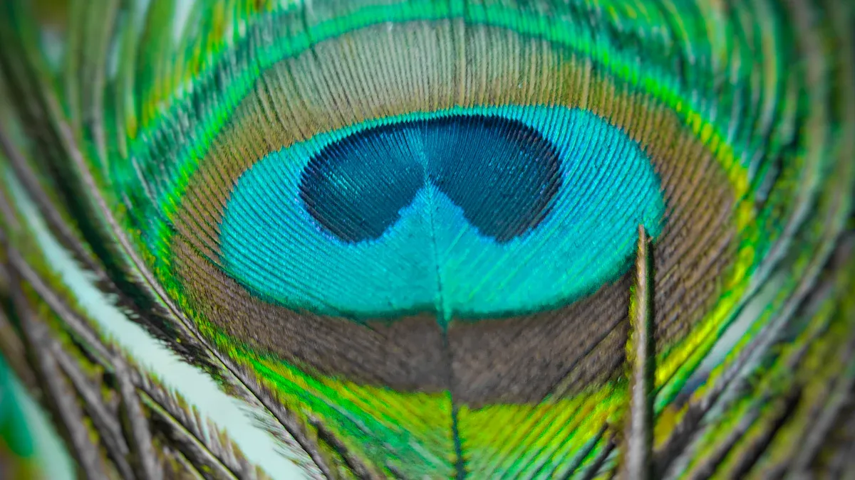
You can tell teal and turquoise apart by how they look and feel. Teal is a medium or dark greenish-blue color. It makes you feel calm and balanced. Turquoise is a bright blue-green that feels full of energy. It makes people feel happy and excited.
|
Color |
|
|---|---|
|
Teal |
Medium to dark greenish-blue; sophistication, balance, calmness |
|
Turquoise |
Bright and vibrant blue-green; energetic, uplifting qualities |
Here is a quick checklist you can use: Look for deep and rich colors if you want teal. Pick turquoise if you want something bright and full of energy.
If you want to learn more, check out these resources: Educational Insights into the Turquoise Colour and Diving into the Different Shades of Turquoise Color.
Now you know how to choose the right color and feel sure about your choice.
FAQ
How can you quickly tell teal from turquoise?
You can look at the brightness. Teal looks deeper and more muted. Turquoise appears brighter and lighter. You can also check the hex codes: teal is #008080, turquoise is #40E0D0.
Can teal and turquoise work together in a design?
Yes, you can use both colors together. Teal adds depth. Turquoise brings energy. You can pair them for a balanced look in rooms, outfits, or graphics.
Why do teal and turquoise sometimes look different in photos?
Lighting changes how you see colors. Natural light makes turquoise look brighter. Warm indoor lights can make teal look greener. Always check colors in different lights before you decide.
What colors go best with teal and turquoise?
Teal pairs well with gray, navy, or cream.
Turquoise looks great with white, tan, or coral.
You can mix both with neutrals for a modern style.